Background
Metra is the rail system that operates and oversees a 546-mile commuter railroad system in the Chicagoland area and suburbs. A division of Chicago’s Regional Transportation Authority, the Metra rail system was created in 1983 as a reorganization of the RTA following a succession of finical crises. With over 80 million annual riders, 241 stations and 11 rail lines, Metra is the largest rail system outside of New York City (via American Public Transit Association, Metra, and Encyclopedia of Chicago).
Design Challenge
Many still rely on trains to commute in and out of the city, but a new age requires legacy companies stay up to date and remain a strong presence online to help remain present to both current and future riders. Boarding trains can be confusing enough, especially when dealing with delays and abstract times- this interface demands clarity and ease of use to help ensure everyone gets where they are going.
User Research
Research Questions
I began my research pinpointing what it is I’m looking to solve. Before surveying the public, I needed to formulate what questions I was looking to anwser.

Research Methodology
To gather information, I created a poll that helped collect 127 responses cited other Train rail system sites and apps, such as Chicago’s CTA and New York’s Amtrak to figure out where Metra was lacking and what could be added to produce a better experience for the user.
When asked what should be expected from a website and mobile app, the common themes for improvement were:

Where do you check train schedules?
Where do you most often buy tickets from?
70% of users checked train schedules on the Metra website while 59% bought tickets through the Ventra mobile app.
Both of these actions should be happening in the same place.
It became apparent that this, among other issues, made these apps rife for a redesign. After collecting this data, I took to figuring out what features were feasible and which ones were unrealistic to implement because of technical limitations.
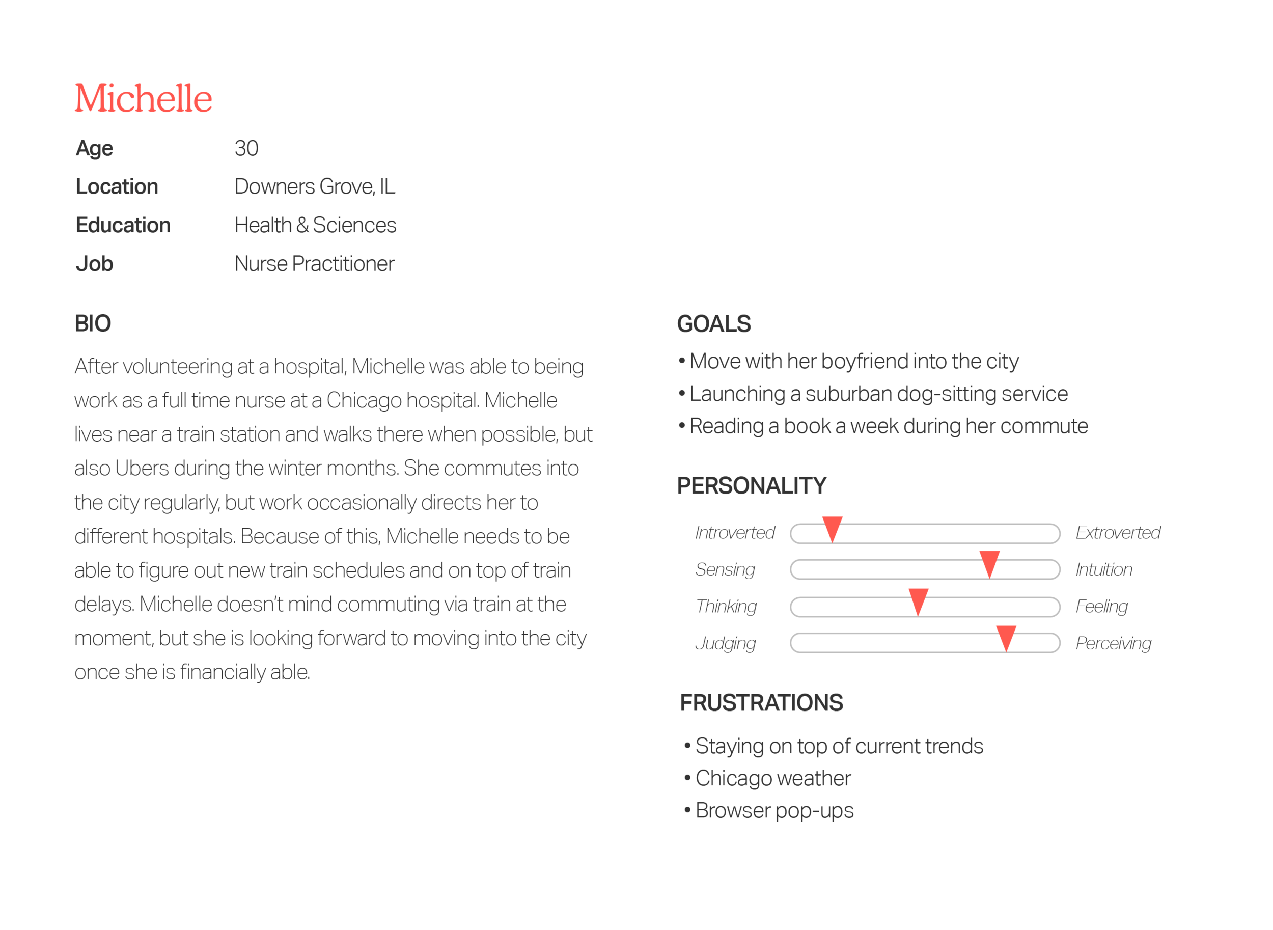
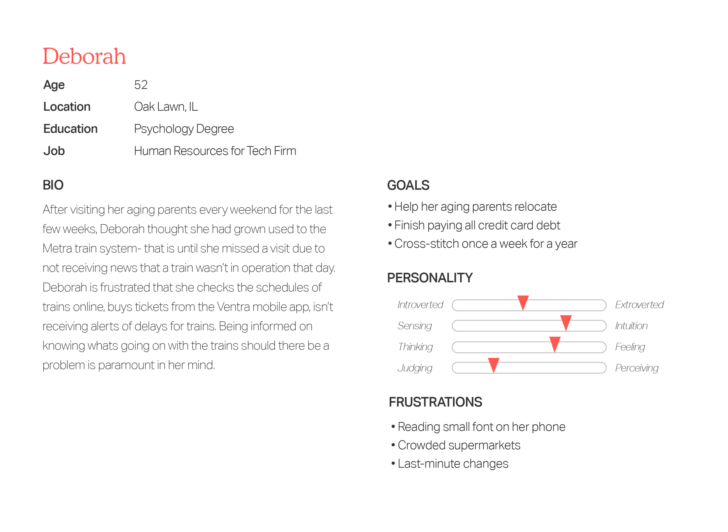
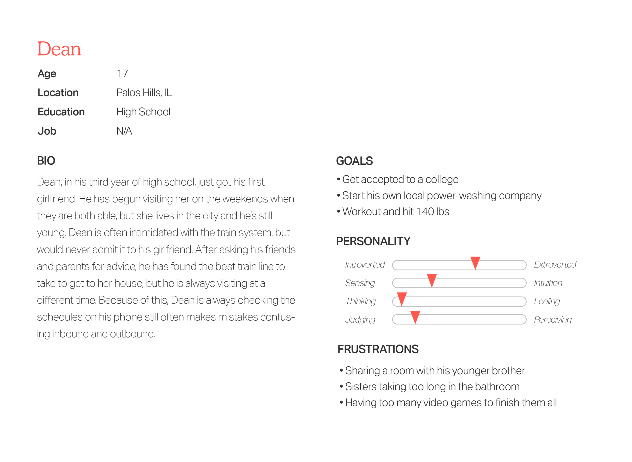
Persona
Setting up my target audience for the app, I wanted to include those familiar with taking the rail system, and those newer to it. Mobile redesign ensures the most amount of people will be able to access Metra, especially if tickets are also purchased within the app. Many of these personas are modeled after real friends of mine that reflect similar struggles.
INITAL SKETCHING

USER FLOW

WIREFRAME

User Testing
Inital Prototype
““Having my location on did help me find the nearest station, but that in practice didn’t work because it’s not the station that will get me to Chicago on time””


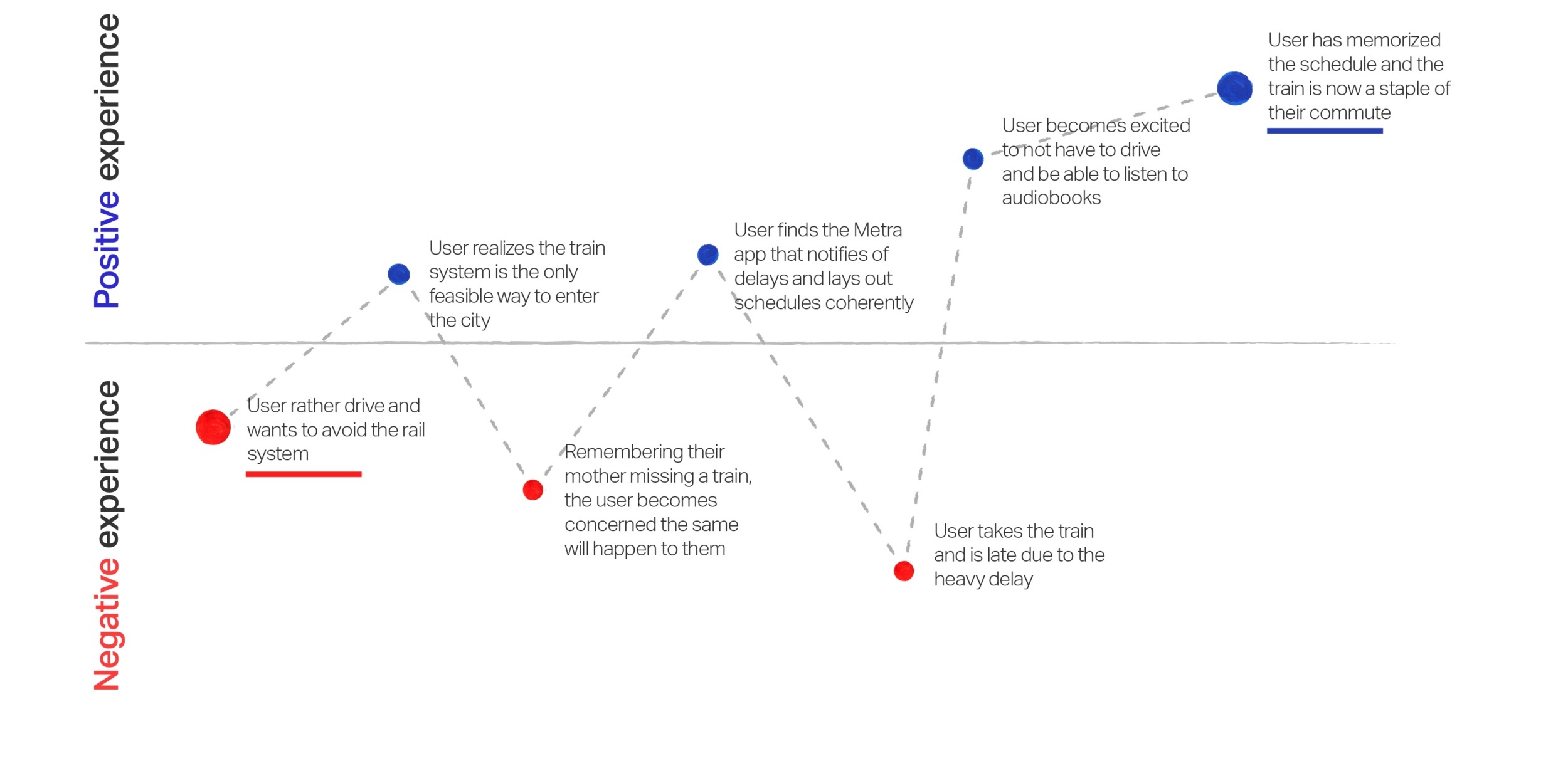
Emotion Mapping
UX Strategy

User Interface
Logo
Metra’s current logo is certainly a product of its time- angular and obtuse. To keep the Metra seeming inviting and simple to ride, I wanted the soft edges to be welcoming and the italic motion to convey swift travels to help represent the brands values.